
Ithaca
My Role
User Research, Interviewer, User Flow & Stories, UI Sketching, Visual Designer
Year
September 2020 - December 2020
Skills
Holding Contextual Interview, Affinity Diagramming, Storyboard, Usability Design, Paper Prototyping, Balsamiq, Figma, Heuristic Evaluation, Usability Testing
Overview

Overview
With a limited number of parking spaces and expensive parking prices, Ithaca isn't a parking haven. Also, lots of residents in Ithaca don't have proprietary parking spots. Our team noticed and understood the pain those college students and residents are facing. Therefore, we designed ParkMe, a one-stop application, to connect drivers with available parking spaces at affordable prices and convenient locations and address the untapped market of mobile-app car valeting services.
The initial outcome was to help Cornell students living in Collegetown and owning at least one vehicle find short-term and long-term parking spots. In addition, we incorporated the valeting service into our platform to provide users parking assistance when they are in a rush. Our platform eventually received a high satisfaction level, supported by a user study.
Problem

Figure 1: Interview Notes
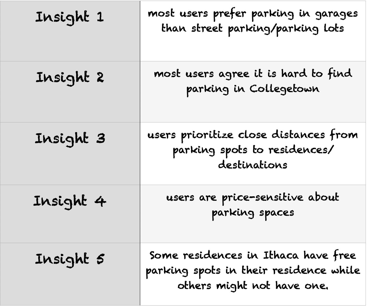
Before the designing process started, we conducted a series of interviews and gained five insights from our targets. These insights reflected that Cornell students and residents are struggling with parking due to limited parking spaces, high prices, unavailable reserved residence parking, and undesired street parking.
There are numerous websites and mobile Apps available to help Ithaca residences solve the parking issue, such as ParkIthaca, SpotHero, Spacer, Ithaca Carshare. However, these websites or Apps only provide single or limited technical functions, which include showing users updated parking rates, showing available street and garage parking spaces, operating as parking timers, directing users to available parking spaces or specific garage entrances, and allowing users to pay for Ithaca street parking on their phones. There isn't a platform that combines all of these functions and providing users a one-stop solution. Consequently, users need to download multiple apps for parking, which is frustrating.
Solution
Our project is mainly research-oriented. We believe that to create a user-friendly platform, we have to know users' pain points, wants and needs, and to learn from their feedback.
Timeline
To complete this semester-long project, we divided our projects into 4 phases, conducted 2 user studies , and delivered an UI design for the platform.
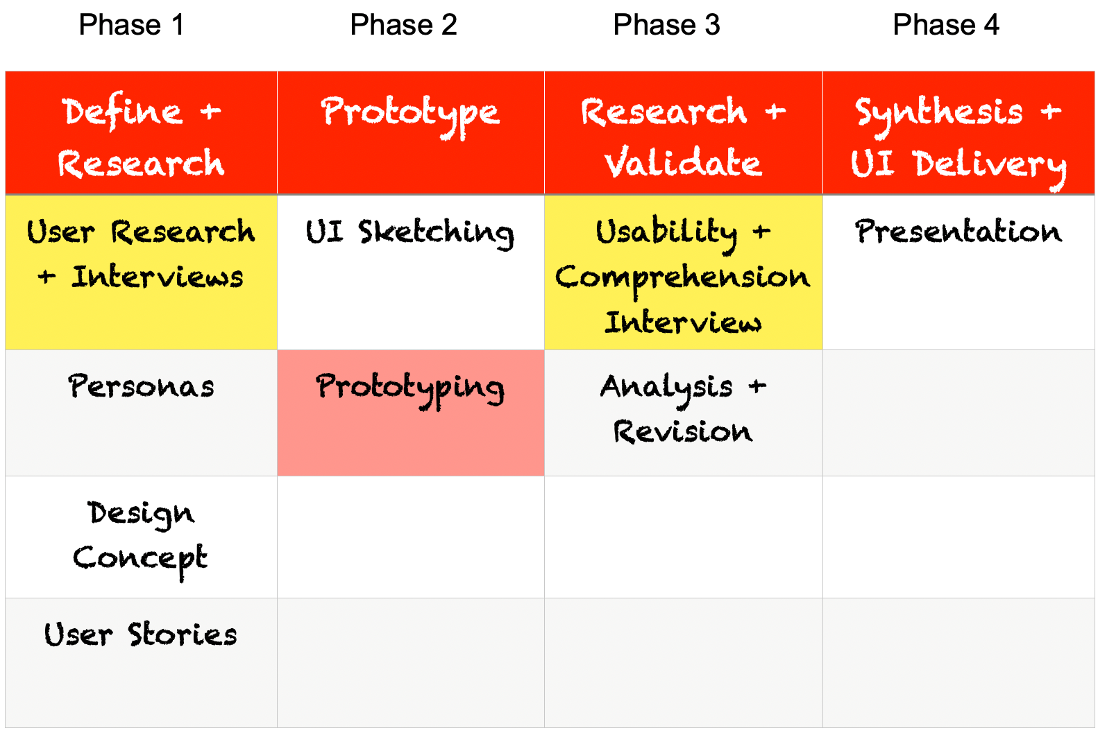
Timeline
Design Concept
After the user researches and interviews (notes shown in Figure 1), our team came up with design concepts, which keep us true to our original intentions during the entire design process.
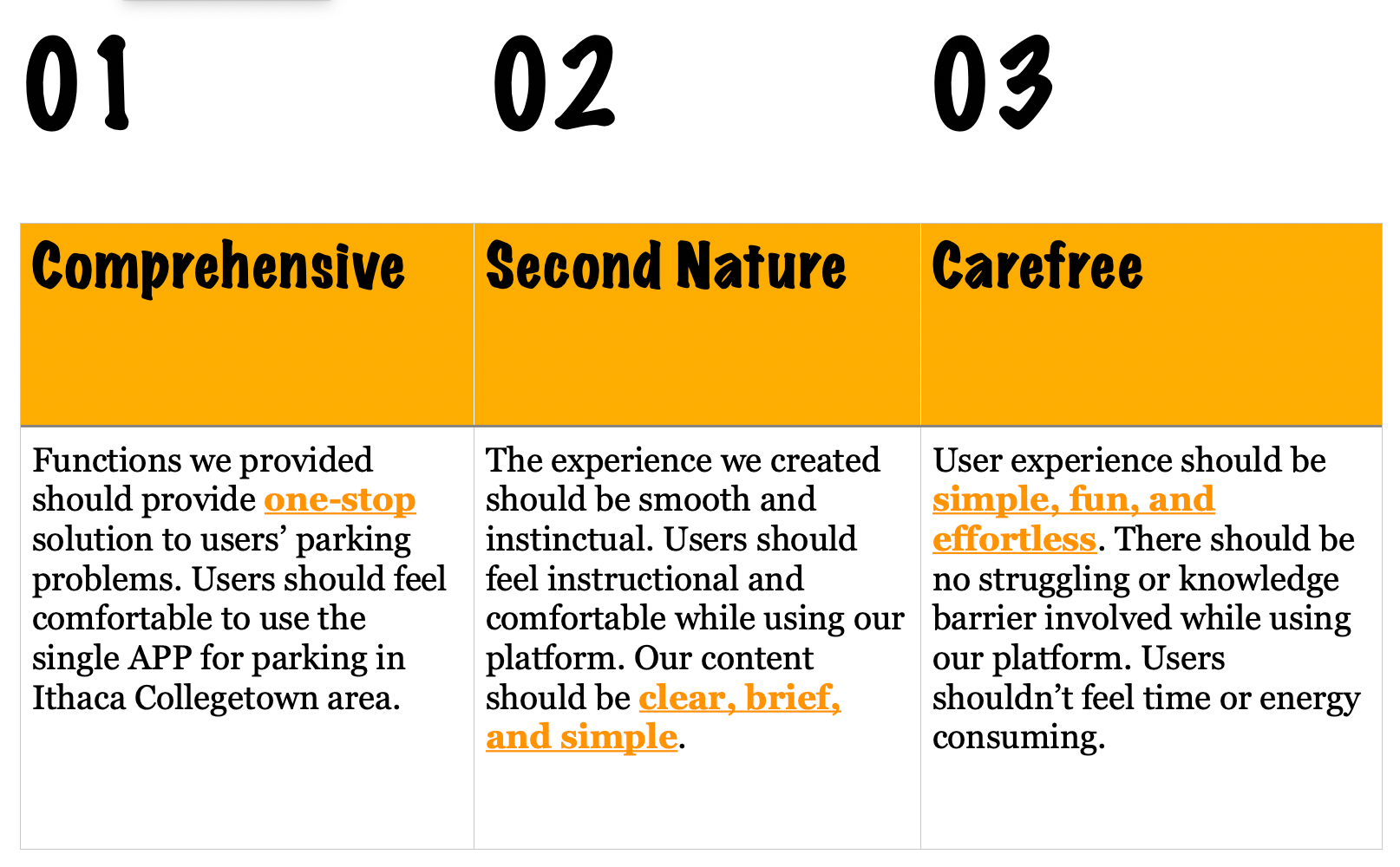
Design Concept
User Stories
Our team came up with 3 user scenarios based on 3 main function features
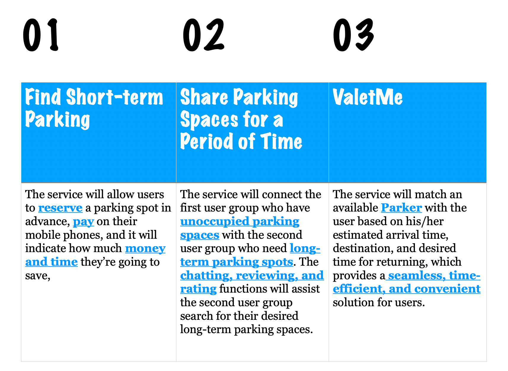
Function Features
Scenario 1:
Look for available parking spaces on a specific road and find what days
those parking spaces are available for reservation
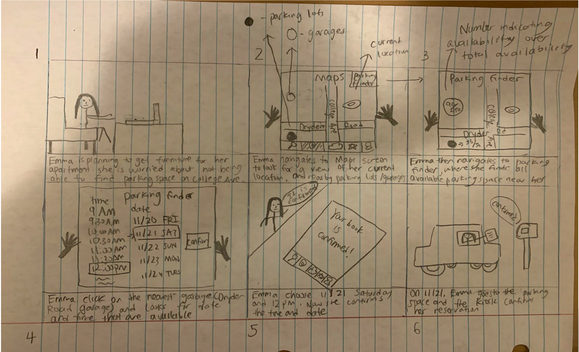
Scenario 1
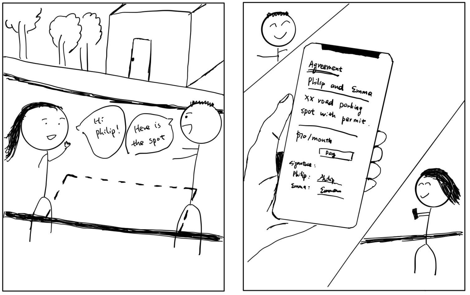
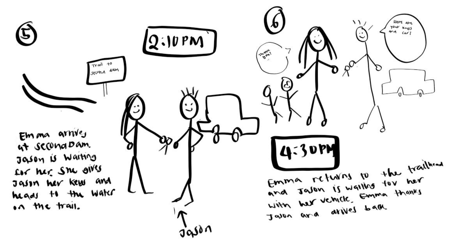
Scenario 2 (MY ROLE):
Search for desired long-term parking space by entering preferences on the filter,
look for reviews and ratings on specific users

Scene 1
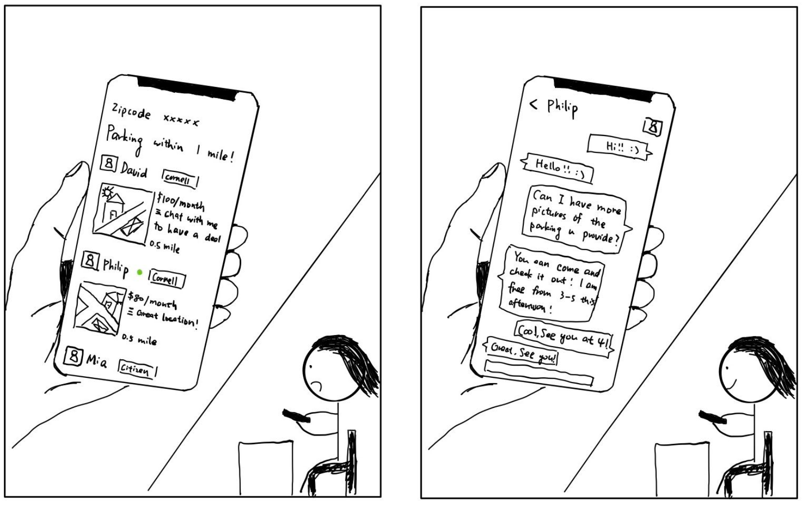
Scene 2
Scene 3
Scenario 3:
Request valet service for your car
Scene 1

Scene 2
Scene 3
Prototype

Homepage
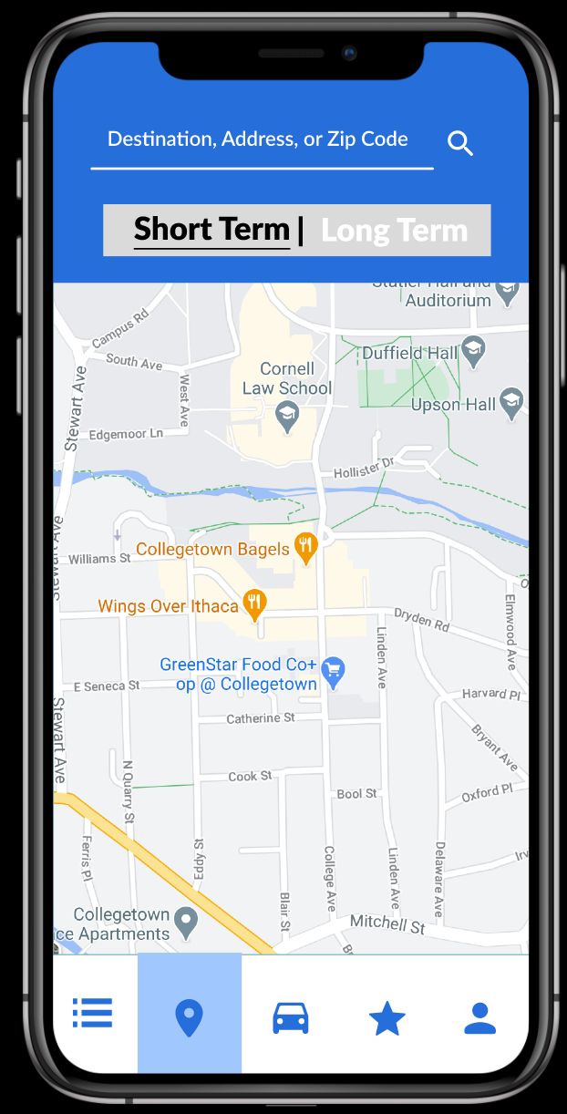
Short-term Search
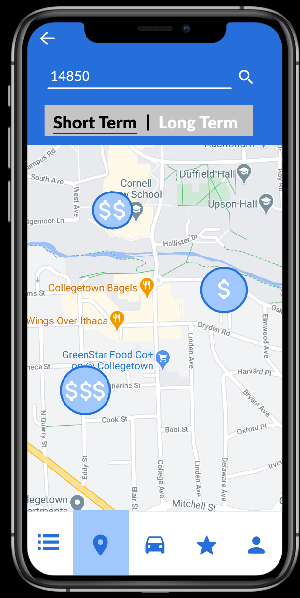
Search Result
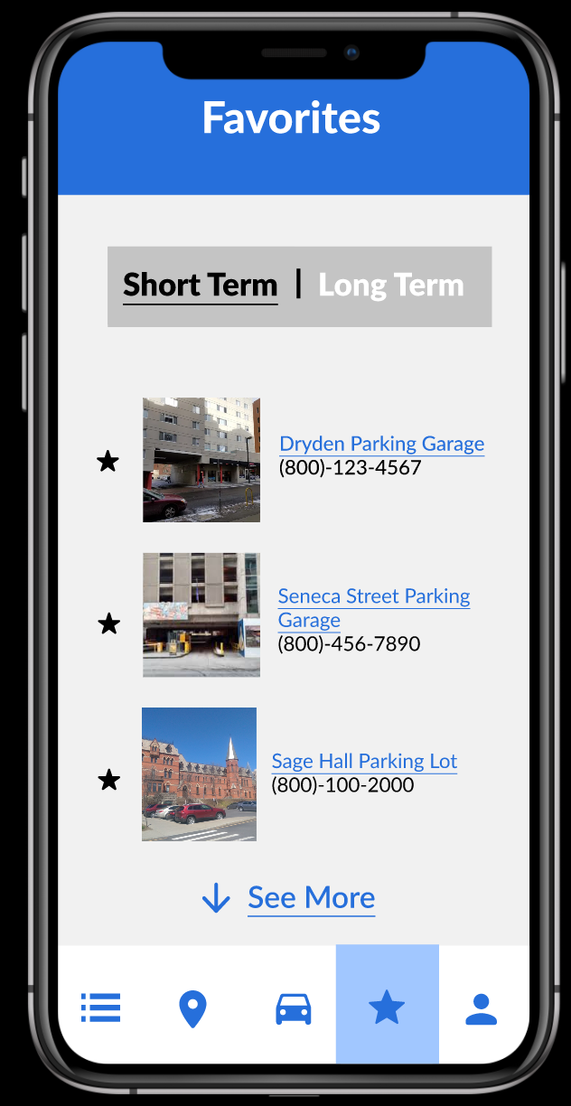
Favorite
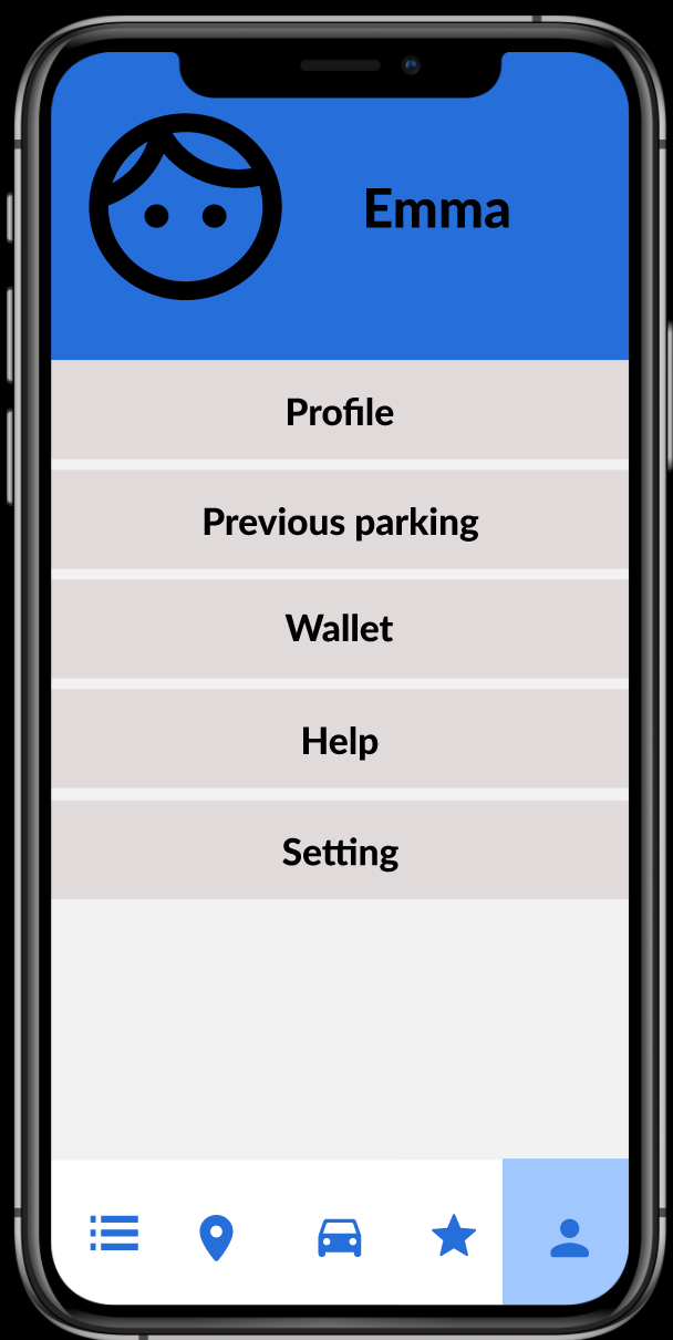
Profile
Based on user stories, we created a prototype for the UI of our platform:
<https://www.figma.com/file/FHkztLRJJ0E4zHuZBfz9bV/APP?node-id=0%3A1>
Video 1: Prototype Demo
Usability Research
Before the final delivery, we conducted 3 in-depth user interviews to examine the platform's usability in order to design a more user-friendly, intuitive application.

Interviewees Demographics
Based on the usability research, our team found 3 designs hindering the usability:
(1) Rating System:
Ratings for the Parker can be given only by dragging the ‘finger’ across the stars.
Both interviewee #1 and #2 did not know how to use the rating system of the valet parking feature.
(2) List Feature:
Users can only select a listing via clicking on the title text, and not anywhere else on the listing.
Interviewee #3 attempted to click on the image of a listing to select a long-term parking spot.
(3) Menu Bar:
Icons used to denote different features of ParkMe might be confusing for users.
Interviewee #3 initially thought that the ValetMe icon led to the long-term parking service.
Final Delivery
Our team made adjustments corresponding to users' complaints and delivered out final UI design.
Video 2: Final UI Design
Our final UI design can be find here:
https://www.figma.com/file/KymwytybFjTkaLTDP13H6Z/APP-(A5-Group-Final)?node-id=0%3A1
Reflection
Users always bring solutions to developers
As a developer who has no background or experience in UI design, I realized the importance and usefulness of user research in every development phase. Users know what they want, what they need, and what they hate. As a developer or designer, we truly need to hear from them, since they will bring fresh air, new opportunities, and even solutions to us. Moreover, every UI design shouldn't be a one-time task. Instead, it requires constant iteration to design and re-design features that excite users and smooth their experience.
I'm grateful for the opportunity to implement what I learned from classes into something that will help people solve their problems. Also, I appreciate my teammates' patience, intelligence, and effort towards design.
